M
E
N
U
Rydoo, formerly Xpenditure, is a solution for managing business travel and expense reports. We were responsible for Rydoo's new graphic identity and the creation of the marketing website, in collaboration with Leo Natsune.


YOU
Highlighting and making a management tool accessible to professionals.
GO TO WEBSITE

ME
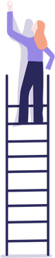
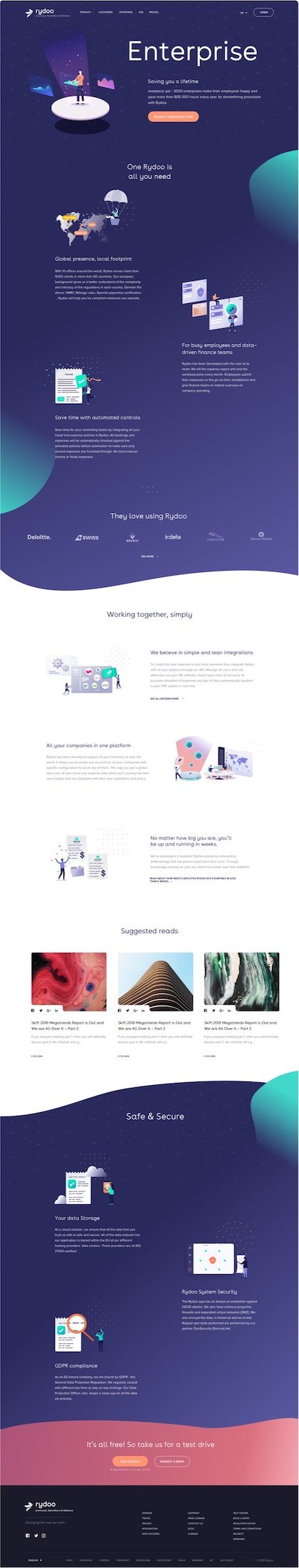
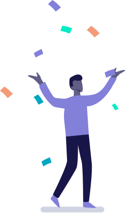
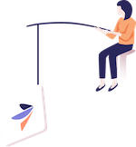
We decided to contrast and break up the somewhat austere image of an accounting management tool by using illustrations with rounded borders, a palette of warm colors and large curved patterns.
Mission
ANNÉE
2018
SERVICES(S)
Design, Integration
SUPPORT(S)
Interface, Marketing website.
TYPOGRAPHIE
Proxima Nova
BuenosAires
This typeface refers to Avenir and Futura. Due to subtle, playful moments, the font looks friendly. Whether body text or title, the open forms appear generous. Its alternate set of lowercase-a and lowercase-l, without swashes, gives the font a broad but consistent range of appearance.
Proxima Nova
The Proxima Nova family is a complete reworking of Proxima Sans (1994). The original six fonts (three weights with italics) have been expanded to 48 full-featured OpenType fonts. There are three widths: Proxima Nova, Proxima Nova Condensed, and Proxima Nova Extra Condensed. Each width consists of 16 fonts—seven weights with matching italics.Stylistically, Proxima Nova straddles the gap between typefaces like Futura and classic sans faces. The result is a hybrid combining humanistic proportions with a somewhat geometric appearance.
COLORS
Palette
US
The message is clear, the tone is direct and the use of illustrations throughout the website makes the product fun and simple.
DEGRADE ROUGE
#AB5377
#D86F7C
#F3A5B0
DEGRADE VIOLET
#2A295C
#8282DC
DEGRADE BLEU
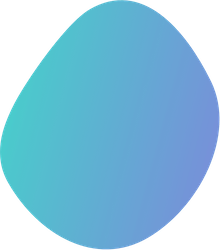
#3DDCC8
#8282DC
VIOLET FONCE
#2C295D
ORANGE
#FF9673
VERT-BLEU
#45D2CA
GRIS
#878699
GRIS CLAIR
#CFCEDB
ROUGE
#D26F7E

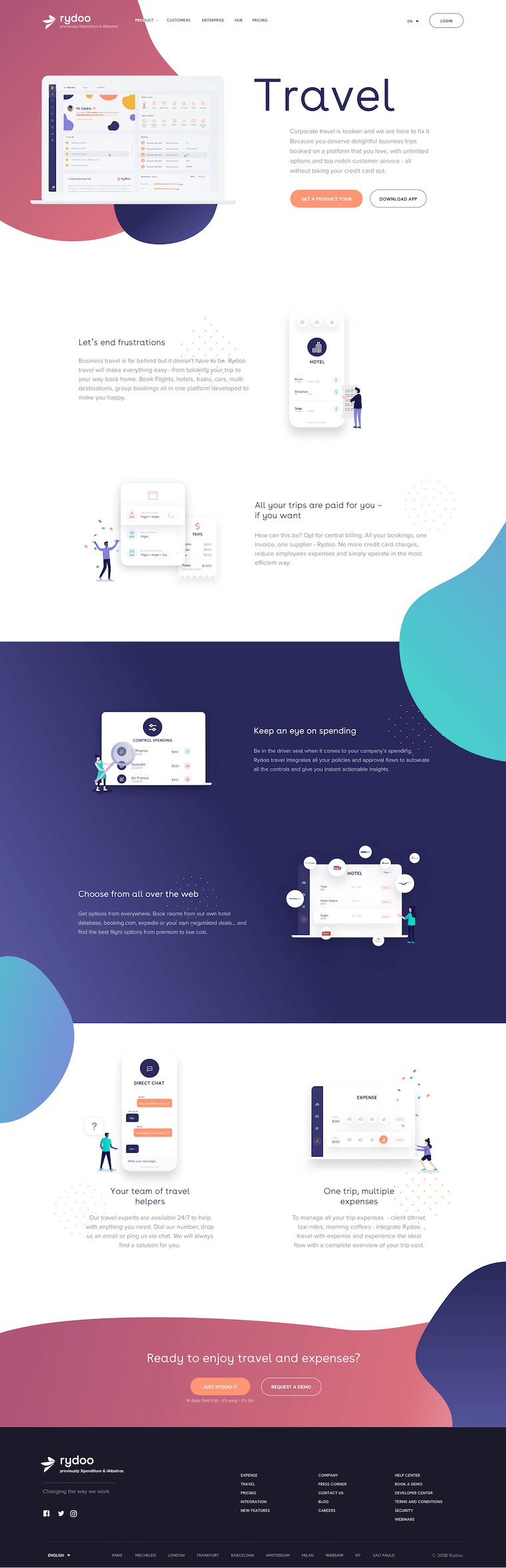
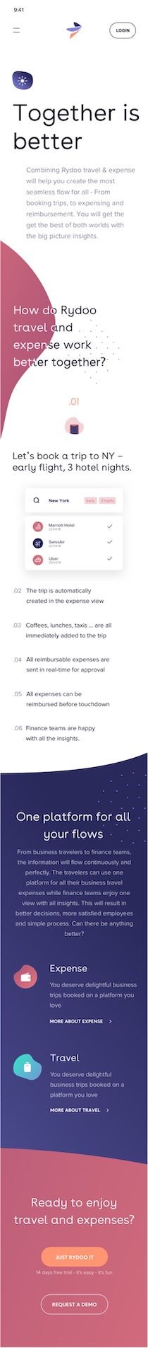
RESPONSIVE DESIGN
Our expertise
The optimal responsive experience.
Rydoo is no exception to the rule. For us, responsive design must be pixel-perfect.
Especially when it comes to offering a mobile/desktop application, it is important that reading and searching on the mobile app is as clear and optimized as possible.
JOIN RYDOO
Career page

FIRST PROPOSITION
Homepage
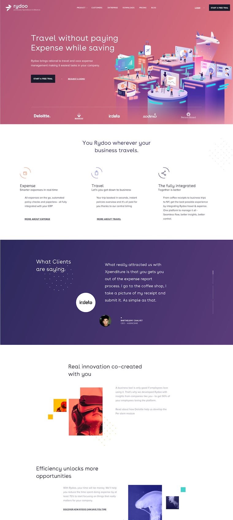
For our first demo, we proposed a cover with a very colorful, warm background, with a slight gradient behind Leo Natsume's illustration. The black "calls to action" provided contrast and character to the page.
Finally, to add a human touch, we favored photography over illustrations within the sections.

MADE BY
Barthélémy Chalvet
Marine Legrand
Léonard Chalvet
Lou Bontemps