M
E
N
U
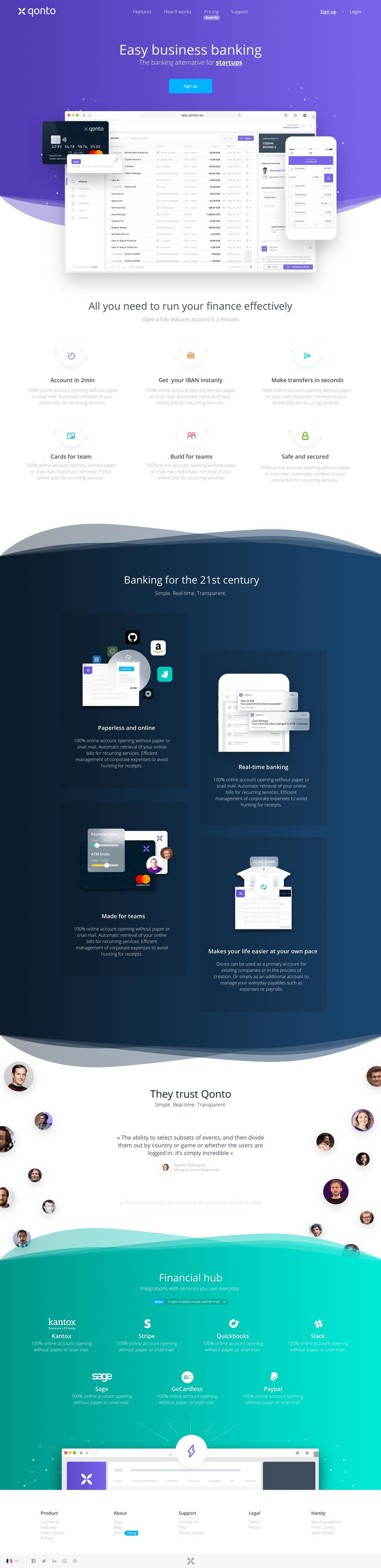
Qonto is an online banking application that’s intended to be used by people who are self-employed, early stage companies, and SMEs. We created their entire website, application design, and integrations.

YOU
How can we make the digital banking experience simpler and more innovative, and entice more entrepreneurs?
VISIT WEBSITE
ME
Use bright and saturated colors, add color shades, and highlight your graphic elements in a sleek and subtle manner.
Mission
YEAR
2017
ROLE
Design, Front-end development
TYPE
Marketing website

TYPOGRAPHY
Open Sans Family
Open sans family
Open Sans is a humanist sans serif typeface designed by Steve Matteson, Type Director of Ascender Corp. This version contains the complete 897 character set, which includes the standard ISO Latin 1, Latin CE, Greek and Cyrillic character sets. Open Sans was designed with an upright stress, open forms and a neutral, yet friendly appearance. It was optimized for print, web, and mobile interfaces, and has excellent legibility characteristics in its letterforms.
COLORS
Palette
US
A fun website with a strong online presence and an outstanding user experience.
PRIMARY
SECONDARY


Simple and easy-to-understand features
Qonto is all about make banking more accessible for entrepreneurs. But their digital banking platform was full of complex informations and conflicting functions which needed to be simplified and organized.
PRODUCT PAGES
Features
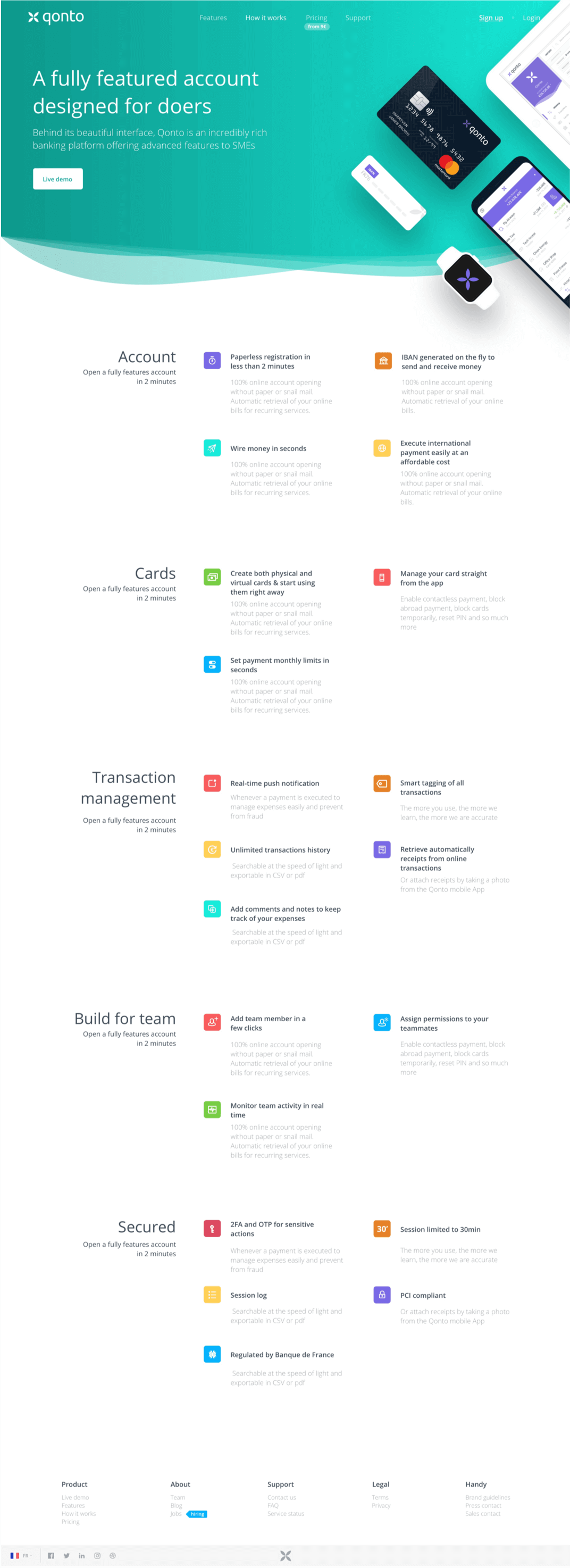


DISCOVERING OFFER
How it works


DISCOVERING OFFER
Pricing
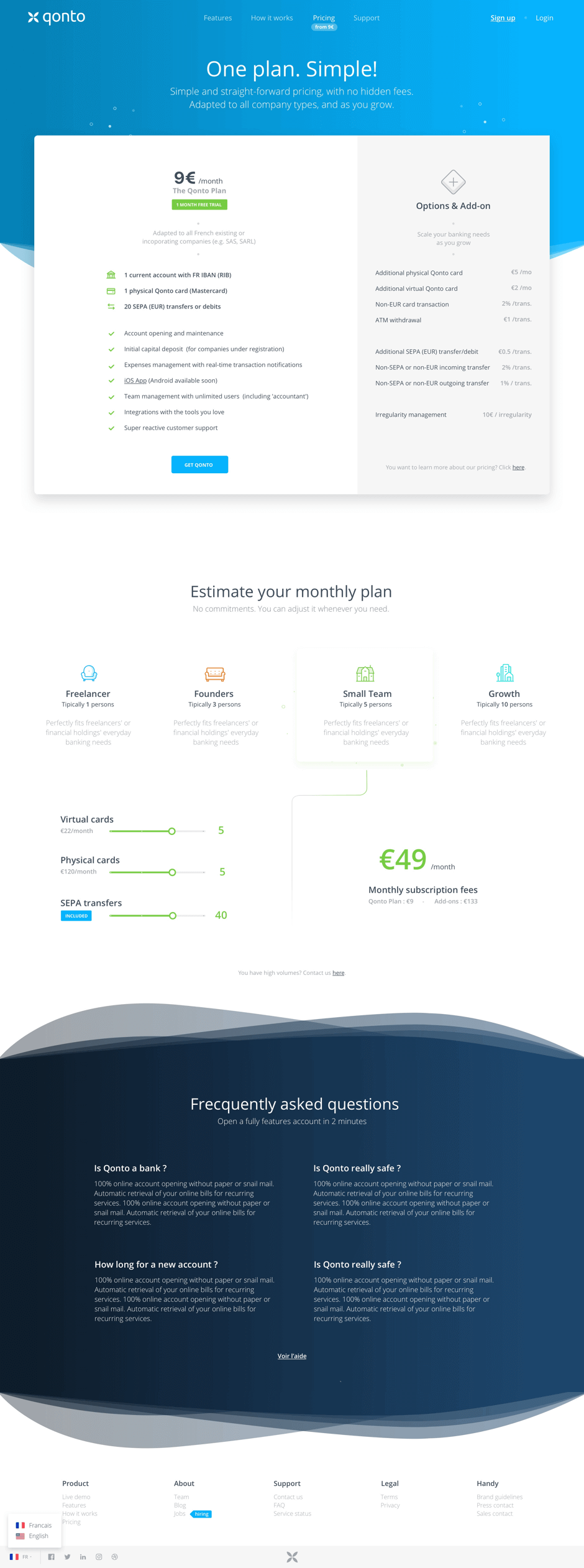
Founders
Tipically 3 persons
Perfectly fits freelancers' or financial holdings' everyday banking needs
Freelancer
Tipically 1 person
Perfectly fits freelancers' or financial holdings' everyday banking needs
Small Team
Tipically 5 persons
Perfectly fits freelancers' or financial holdings' everyday banking needs
Growth
Tipically 10 persons
Perfectly fits freelancers' or financial holdings' everyday banking needs
MADE BY
Barthélémy Chalvet
Léonard Chalvet
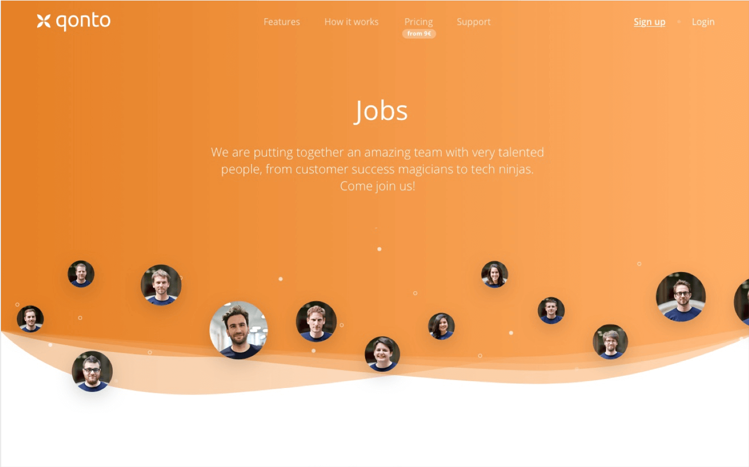
Qonto Team